This is the first of a series of technical blog posts that document how The Policy Lab at Brown University built an interactive data dashboard with United Way of Rhode Island to support analytics and decision-making with COVID-related 211 call data. This post will cover the background of this project and the decisions The Policy Lab team made on the tech stack. Please use the following link to jump to the rest of the story.
- Part 2. Building the Skeleton of the App with Vue.js
- Part 3. Rendering the Visualizations
- Part 4. UI/UX Refinements from Stakeholder Feedback
Background of the project
Operated by United Way, 211 is a free and confidential service that helps people across North America find the local resources they need 24 hours a day, 7 days a week. Since the beginning of the COVID-19 pandemic, the United Way of Rhode Island has played a vital role in handling a range of support calls to the COVID-19 hotline at the request of the Governor’s Office, including after hours information and managing a rental assistance program.
In order to track trends in these calls geographically,over time, and by assistance category, the 211 team asked The Policy Lab to help them build an interactive dashboard that caters to the most pressing needs in analytics and provides the easiest and quickest way to reveal trends and patterns in the 211 data.
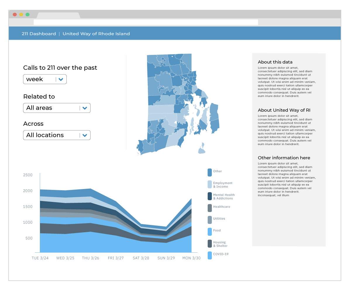
First draft of the design
After communicating with the team at United Way of Rhode Island, Ben Guhin Delphine, then Head of Design at The Policy Lab, created the first sketch of the design (see below). This first draft includes a stacked area chart, a choropleth map, and a few dropdowns that allow the users to filter the data. The stacked area chart, compared with line charts, helps users to see trends in call volumes not only across categories but also in total. Mapping calls to the geographical regions where they originate also reveals needs for resources across RI cities and towns.
Decisions on tech stack
For such a project, fast delivery of analytical insights is key. Therefore, we decided to make a custom-made dashboard for United Way of Rhode Island that maximizes interactivity. We initially decided to forgo a backend and use d3.js only. However, while d3 provides its own way to manipulate the DOM and process event triggers, it does not provide a good way to manage the state of user-applied filters. So we added Vue.js for state management and the reactivity required to update the visualizations created by d3. Below is all of the libraries we used to create this dashboard:
- Vue.js
- d3.js
- Vuex (for advanced state management)
- Vue-Formulate (a lightweight form library to create the filter dropdowns on-the-fly)
- moment.js (to handle datetime operations, which can be a pain in JavaScript)
In addition, we used Python for data cleaning and producing a CSV loaded by d3 to produce the visualizations.
Next Up
In the next post, we'll cover some of the technical parts of creating such a tool, building out a skeleton which we'll work on through the following three posts.
How to cite this Reflection: Xu P. (2021, February 20). The Making of a Dashboard - Part 1: Decisions on the Tech Stack. The Policy Lab. https://thepolicylab.brown.edu/reflections/making-of-a-dashboard-part-1


