In this post, we will cover the details in creating the data visualizations used in the United Way Rhode Island 211 Dashboard to reveal patterns in 211 calls. The previous post described in detail the overall architecture of the app and how data is persisted as state in the Vue app. This post focuses more on the gotchas using d3.js to create interactive data visualizations.
- Part 1. Decisions on the Tech Stack
- Part 2. Building the Skeleton of the App with Vue.js
- Part 4. UI/UX Refinements from Stakeholder Feedback
General Design Patterns
Each of the visualizations lives within a Vue component. The overall structure of the component looks like this:
export default {
  data() {
    return {
      filteredData: null, // stores the result of the filterData method

      // persist a chart object with an updateChart method that can be called
      // when the filter is updated.
      chart: null
    };
  },
  props: {
    rawData: Object,
    filter: Object
  },
  methods: {
    // inititalizes the chart and returns a chart object with an updateChart method
    initChart(filter) {},
    // filters rawData and returns filteredData in the components state
    filterData(filteredData, filter) {},
  },
  created() {
    // filters the data and creates the chart when the component is being created
    this.filteredData = this.filterData(filter);
    this.chart = this.initChart(this.filteredData, this.filter);
  },
  watch: {
    filter: {
      deep: true, // create a "deep watcher" that monitors each element of the object
      handler(newFilter) {
        this.filteredData = this.filterData(newFilter);
        this.chart.updateChart(this.filteredData, newFilter);
      },
    },
  },
};
The above code snippet shows that the component receives as props the 211 data loaded from a .csv file and a filter objects that contains all of the parameters of the filter. Whenever the component is created (i.e. when the created() lifecycle method is called), the filterData method is called and the result is stored in the component's state. Then the initChart() method is called, returning in a chart object, which is also saved to the component's state. This chart objects itself has an updateChart method, which can be used to update the chart. This follows the d3.js design pattern described in this article to keep d3 code centralized in the Vue component.
Each component also has a deep watcher that watches the filter props. Whenever the filter changes, its handler will call the filterData method again, and then call the updateChart method of the chart object persisted in the state to update the chart.
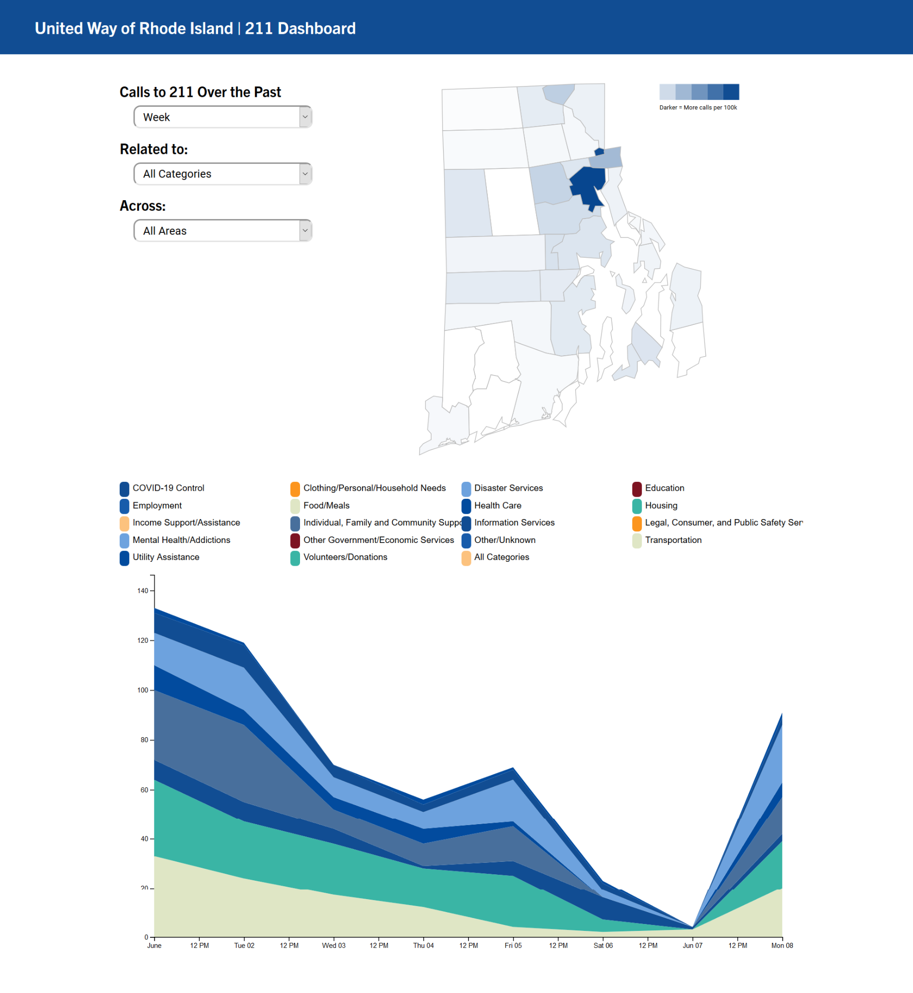
Let's Make the Map!
Making a map (choropleth) with d3.js is a widely covered subject. There are many tutorials avaiable that walks you through how to create a map using geojson/topojson in d3. For example, this Observable notebook by d3's creator Mike Bostock contains code for creating choropleths in d3 v5. This article is also a great tutorial for creating such maps. What I want to cover in this section is a few things that got me stuck for hours.
1. Finding the correct geojson/topojson for the base map
Typically you should have no difficulties finding a geojson/topojson file that contains the correct border outlines for the geographical information that you want to plot. However, these files are made to be very precise and tend to be too big for a project like this. The geojson file that I got at first from the RI GIS website was over 6MB. I tried to use MapShaper to reduce the file size but d3 had problems reading the files it produced. I eventually found a topojson file that was small enough. So, you might need to spend some time finding the right files for the base map, especailly if you are focusing on a state or a smaller region.
2. Using the correct projection
We will need a projection function that projects geographic coordinates to planar coordinates that can be used to draw SVG paths with d3.js. If we were creating a map of the United States, then the AlbersUSA projection comes in quite handy. In this project, I used the mercator projection, which had to be scaled over 30,000 times with numerous trials and errors to make the map look the way it is.
After the dashboard was created, I discovered this post that talks about using UTM (Universal Transverse Mercator) projection for mapping small areas, which we may migrate to in the future. I welcome any comment/feedback on other ways to project the map of states that does not require as much correction.
3. The infamous MAUP problem
Another problem that I encontered when mapping the 211 call data is this so-called Modifiable areal unit problem (MAUP), which, in this context, means that the number of calls plotted on a map is a reflection of that area's population density. In this case, since Providence is Rhode Islands's densest population center, naturally many more 211 calls originate from Providence, which results in a map with only Providence highlighted. I modified the color scale to reflect the number of calls per 1000 capita to preserve some interpretability. I also welcome any suggestions/comments on other ways to produce maps that are less biased by population density.
Stacked Area Chart with Smooth Transitions
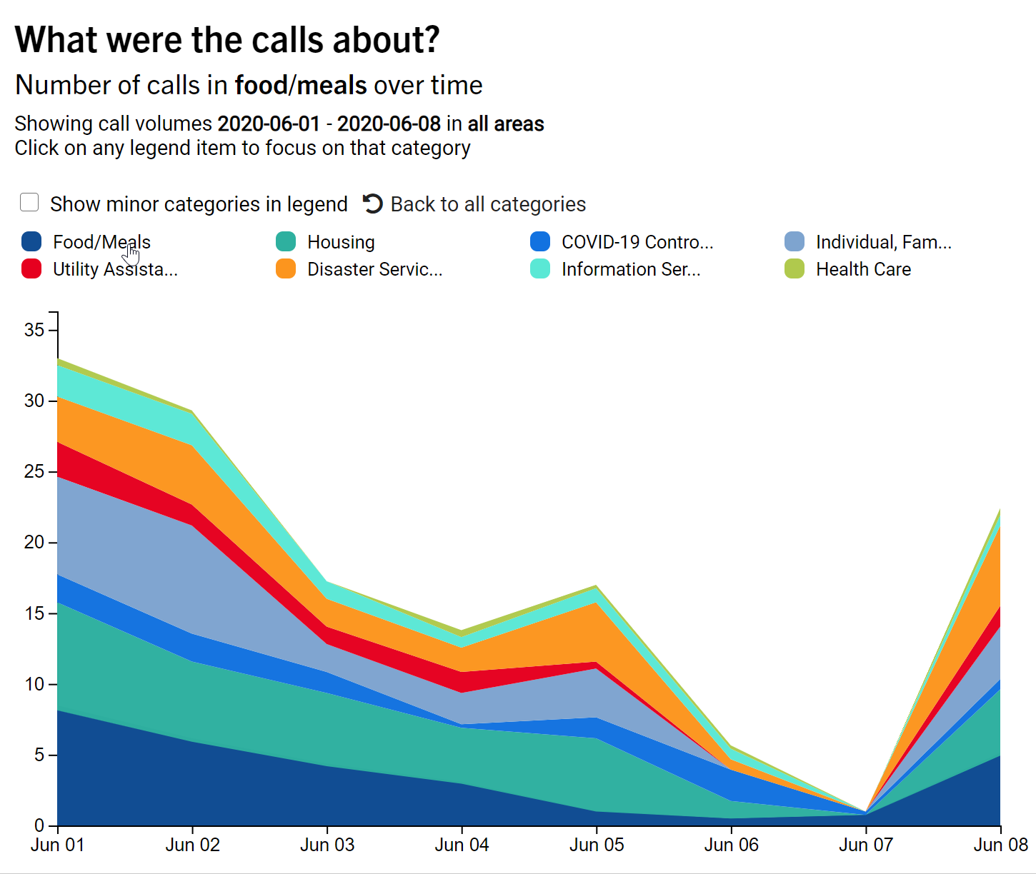
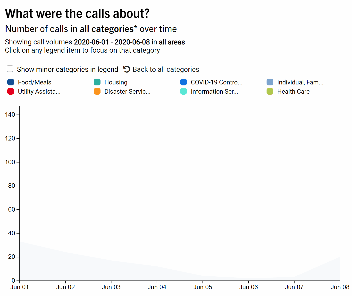
As with the Map, we are not going to be concerned with how to create a stacked area chart in d3.js. This great tutorial covers this topic thoroughly and nicely. Also, I would recommend that you use a library such as vega, vega-lite, chart.js, c3.js, apex charts and any other JavaScript charting library to create it, because while creating the area chart itself is not difficult, creating informative tooltips can be quite involved. Here, we are using plain d3 for two reasons. First, there are too many categories in the data and we would like to only display major categories when all categories are shown. That means we will need to customize the legend a little bit. Second, we also want to create smooth transition animations when the data changes. We cannot achieve such deep customization with a library. The rest of this section will focus on how we created the smooth transition animations for the stacked area chart shown below. We will also touch upon some gotchas in data wrangling in the browser with d3, and how to display time series data properly with time scales.
Creating smooth transitions
d3 provides a transition function that allows smooth transition animations when the underlying data of the visualizations changes. This article shows a really cool transition with a streamgraph. With the transition() and delay() functions, it is very easy to create such animations. However, the transition breaks down when the number of data points on the x-axis changes, such as when a user wants to see the data from last month instead of last week. The reason is that when there is no changes in the number of data points on the x-axis, d3 can figure out that each data point is only going up and down and interpolate the intermediate points between the start and end positions for each data point. However, when this prerequisite no longer holds, d3 will have trouble interpolating the intermediate position for the shapes to change, resulting in unwieldy transition animations that look weird.
The solution to this is to tell d3 to hold the points on both ends of the area charts, these points can only go up and down. Then the rest of the algorithm will figure out how to interpolate the positions of other points, so that the transition looks better. We used the d3-interpolate-path library for this task. To use this library, first install it with npm.
npm install -s d3-interpolate-path
Then, import the library to the code for stacked area chart with:
import { interpolatePath } from "d3-interpolate-path";
Next, when the data changes, pass the interpolation function to
stacks.join(
  (enter) =>
    enter
      .append("path")
      .attr("class", "area")
      .attr("fill", (d) => color(d.key))
      .attr("d", area)
      .attr("opacity", 0)
      .on("mousemove", handleMouseOver)
      .on("mouseout", handleMouseOut)
      .call((enter) => enter.transition(t).attr("opacity", 1)),
  (update) =>
    update
      .attr("fill", (d) => color(d.key))
      .call((update) =>
        update
          .transition()
          .duration(500)
          .attr("opactiy", 1)
          .attrTween("d", function (d) {
            let previous = d3.select(this).attr("d");
            let current = area(d);
            return interpolatePath(previous, current, excludeSegment);
          })
      ),
  (exit) => exit.transition().duration(500).attr("opacity", 0).remove()
);

function excludeSegment(a, b) {
  return a.x === b.x;
}
The above code uses d3 v5's selection.join() function to update the rendered chart using d3's enter, update, and exit pattern. This Observable notebook explains in detail how it works, but the TL;DR version is that it accepts 3 functions that describe what to do with new data points (enter), what to do with data points that have changed (update), and what to do with data points that no longer exists (exit). interpolatePath was used in the callback that handles updates. We first use selection.attrTween() that accepts a function that describes how the tweening between the changes in an specific attribute of a selection should happen. The excludeSegment function defines that as long as the line segment lies on both ends of the area (any two points a, b whose coordinates satisfy a.x === b.x), then these points should be excluded in the interpolation of the transition, resulting in smooth transitions even when the numbers of data points change.
Wrangling data in d3
Since we are not using any backend, any data wrangling such as group aggregations are done with d3. Although d3 provides lots of functions for performing such operations, there is not a data structure such as pandas.DataFrame in Python or data.frame in R that easily and efficiently does group aggregations. In this context, we want to aggregate for each day, in each category, how many calls were received. This would have been a simple call to df.groupby().sum() in Python or similar functions in dplyr in R. d3 provides a d3.nest() function for us to do the same thing, but it's not very straightforward:
let nestedData = d3
  .nest()
  .key(d => d.date)
  .sortKeys(d3.ascending)
  .key(d => d.type)
  .sortKeys(d3.ascending)
  .rollup(leaf => d3.sum(leaf, d => +d.count))
  .map(rawData)
  .entries();
This article provides a few good examples on how nesting works in d3.js. to build the stacked area chart, we created a two-layer nest, with date and type as keys. This step is similar to df.groupby(['date', 'type']) in pandas in Python. Then, nest() provides a rollup function to collect results on leaves in this data structure, which are arrays of objects that have the same dates and types . Here, we use d3.sum() to sum up the number of calls (stored in count). Then we use d3.nest().map() on the raw data to return a map data structure. Lastly, we use the entries() function of the JavaScript map data structure to obtain an array of counts for each type of calls on each day. This array can then be passed to d3's d3.stack() function to create a stacked data structure that can be used to create the stacked area chart.
To display dates correctly
Unlike Python, JavaScript does not have a dedicated type for dates. The Date() object actually stores both date and time as an integer, and it can behave slightly unexpectedly:
> new Date("2020-06-01")
2020-06-01T00:00:00.000Z
> new Date("2020/06/01")
2020-06-01T04:00:00.000Z
The above code was run in node.js. However, in Chrome, what we got was:
new Date("2020-06-01")
Sun May 31 2020 20:00:00 GMT-0400 (Eastern Daylight Time)
new Date("2020/06/01")
Mon Jun 01 2020 00:00:00 GMT-0400 (Eastern Daylight Time)
This might cause some unexpected bugs. My recommendation is to use moment.js for date operations whenever possible, and use UTC time for dates. This means using d3.scaleUtc() for the x-axis for the stacked bar chart. Otherwise, each data points will be rendered slightly before the ticks for each date, since a string like 2020-06-01 is seen as 8pm of the previous day locally (Eastern Daylight Time).
The finished prototype
After all that coding, we arrived at a finished prototype!
In the next post I will discuss the UI/UX improvement we made to the dashboard based on the feedback that we received.
How to cite this Reflection: Xu P. (2021, February 23). The Making of a Dashboard - Part 3: Rendering the Visualizations. The Policy Lab. https://thepolicylab.brown.edu/reflections/making-of-a-dashboard-part-3


