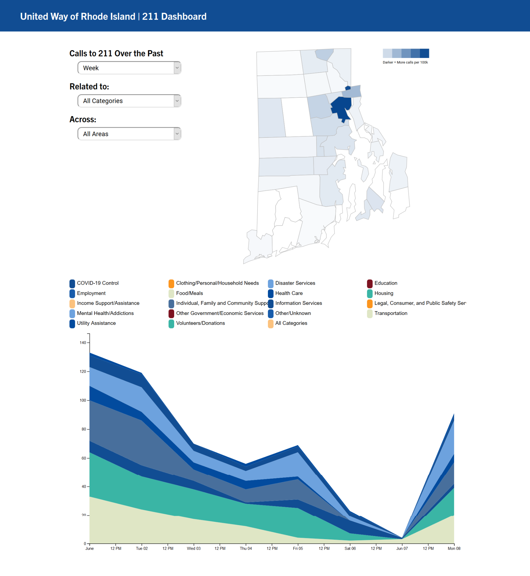
In the previous post we discussed general design patterns that put Vue and d3 together. This post will focus on how we improved the UI/UX design of the first prototype (shown above) according to the feedback from the UWRI team and the rest of The Policy Lab team. We will also discuss the improvements that made the site faster and more responsive.
Links to other posts in the series:
- Part 1. Decisions on the Tech Stack
- Part 2. Building the Skeleton of the App with Vue.js
- Part 3. Rendering the Visualizations
Feedback from the client
We showed the first prototype to the UWRI team and also internally to the rest of The Policy Lab team. The feedback that we received on it was:
- The layout: The vertical positioning of the elements makes it difficult for users to have both the map and the stacked area chart in their browser at the same time, especially on lower-resolution 16:9 screens such as those of the MacBook Air (the dashboard was designed on an 2k screen for which the height of the page was not much of a problem). Some of the spaces on the screen was not very well utilized.
- Need for more context: Although the filters do communicate what information the dashboard is showing, it is still a good idea to unequivocally show the readers what they are looking at, and what they can do with the visualizations. That means that each chart will still need to have titles and additional explanatory texts showing the current states of the charts.
- Missing information: The colors used for assistance categories are indistinguishable from each other, especially since they are recycled because there are so many categories. Also, only the top 8 categories are shown but the users cannot know from the context. The text for the legend of the map and for the axis labels for the stacked area chart are too small.
- Readability issues: The colors used for assistance categories are indistinguishable from each other, especially since they are recycled because there are so many categories. Also, only the top 8 categories are shown but the users cannot know from the context. The text for the legend of the map and for the axis labels for the stacked area chart are too small.
- Handling weekend dips: This feedback came after the initial four. As time progressed, there were far fewer calls to 211 on weekends than on weekdays. Therefore, the "weekend dips" on the stack area chart could obscure the overall trends in the data.
The Revamped Dashboard
Out goes prototype v0.01, in comes Prototype v0.1 (music...)
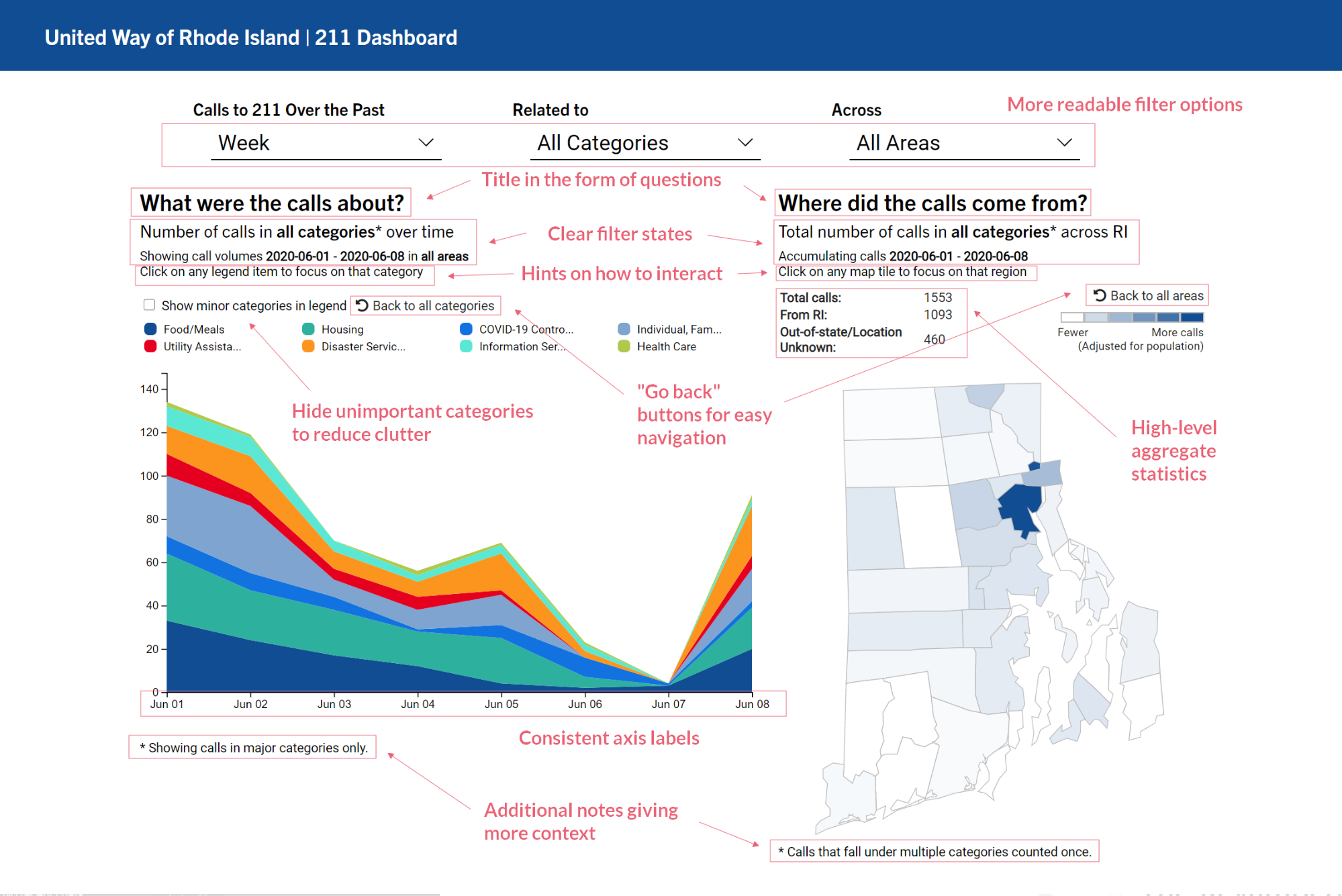
The above image shows the improvements that we made to the very first prototype of the dashboard after receiving stakeholder feedback. Some of the major ones are:
- Layout: We switched to displaying the two charts horizontally to make better use of the space on the page. That way the interactions between the visualizations are more visible. This design is also optimized for 16:9 screen ratios that most laptops use.
- More context: The addition of chart titles, subtitles, explanatory texts, and notes give the users more context of what they are looking at, and the range of data that are being visualized. A bit redundancy here improves readability and clarity.
- High-level information: The new table on top of the map gives users an overview from 10,000-foot simple statistics such as total numbers of calls.
- Readability improvements: The minor categories that are not visualized in the stacked area chart by default are now hidden. The users now have the choice to unhide these categories if they so wish to. The text now has consistent font sizes to increase readability. Category colors were also adjusted to be more distinguishable.
- Navigational aids: Two buttons were added to the visualizations to allow users to go back to the initial states of the visualizations so they do not have to use the drop-down filters for the same purpose.
- 7-day moving average toggle: We added a toggle for the stacked area chart to show 7-day moving averages instead of raw data, which smoothes out the weekend dips and more clearly reveals the trends and patterns in the data.
Other Under-the-hood Improvements
Speed improvement
One thing that significantly impact user experience with a Web app is the performance. Unfortunately, because the dashboard app has to load the 211 call data file before it every component starts to render, there can be 0.5- to 2-second delay before the charts start to show up, a noticeable lag which can significantly affect user experience. Are there ways to reduce this lag?
Yes! The "tidy/long" data format is the culprit here. The long format, although often preferred in analytics with Python or R, it is more preferable to use the wide format in this context. There are a few reasons for this:
- It is easier to operate in rows in JavaScript, as opposed to
DataFramesin Python ordata.framein R, which are optimized for column-based operations. By default, d3 reads rows of acsvas elements of an array. Therefore, it is much easier to operate within each element of the array with functions such asmaporfilter. - The data file for the wide format is smaller. The long format introduces redundancy in the data where category names can be repeated. That usually is not a problem in Python or R, since they have mechanisms to represent categorical variables, but in a Web app, bloated data files affects speed.
- Wide format handles missing data better. JavaScript (d3) does not handle missing data well. Consequently, missing data still need to be present in long format data files rows with zero values, which further increases file size.
After we switched to the wide format, the size of the data file was reduced from 2,518KB to a mere 131KB. We did have to rewrite some code in the filterData functions for the component for each chart, but that also became easier. No longer did we need to use d3.nest() function to produce aggregates for the stacked area chart. We did need to reshape the wide format into a list of objects that can be used with d3.stack() to produce the data for the stacked area chart, but that can be created on-the-fly with the following two lines:
// data format before:
// [
//   {
//     type: "COVID-19 Control",
//     city: "Providence",
//     values: [2, 5, 4. 7, 8 ...] //number of calls on each day from 2020-03-01
//   },
//   {
//     ...
//   }
//   ...
// ]

// Create an array of empty objects, whose length is the number of days present in data
let nestedData = rawData[0].values.map(() => {
  return {};
});

// fill each empty object in the array with type: number of calls pairs
rawData.forEach(
  row => row.values.forEach(
    (d, i) => nestedData[i][row.key] = d
  )
);

// data format after:
// [
//   { "COVID-19 Control": 2, "Food/Meals": 10, ...},
//   { "COVID-19 Control": 3, "Food/Meals": 5, ...},
//   ...
// ]
With these changes, the dashboards now loads instantly and is more snappy than ever, due to the reduced load in reading and restructuring the data.
Responsive design
From Day 1, we wanted the dashboard to be responsive. While it is easy to make the dashboard layout to be responsive, it is not easy to make the visualizations responsive. We used two techniques to make the charts responsive:
- For the map, we simply added a
viewBoxattribute to the map's rootSVGelement. Then the size of the charts will be adjusted. This blog provides an excellent explanation on how theviewBoxattribute works. - For the stacked area charts, we added an
eventListenerto thewindowobject, so that whenever the size of the wrapper changes, the chart will re-render itself. This is done through vanilla JavaScript:
window.addEventListener("resize", () =>
    this.chart.updateChart(this.layoutData, this.options)
);
Wrapping up
This wraps the process in which we designed and built the 211 Dashboard for United Way of Rhode Island. We hope you enjoyed reading about this process! If you have any comments/suggestions, please feel free to drop us an email at thepolicylab@brown.edu to discuss it with us!
How to cite this Reflection: Xu P. (2021, February 24). The Making of a Dashboard - Part 4: Refinements and Stakeholder Feedback. The Policy Lab. https://thepolicylab.brown.edu/reflections/making-of-a-dashboard-part-4


